What information do you need to work effectively? That’s not a random question, but one that informed precisely how we developed the new dashboard in our brand new training success platform. Our new dashboard is completely customisable to individuals using any data that is relevant to their job role. In short: the information you need, when you need it.
Let's take a look…

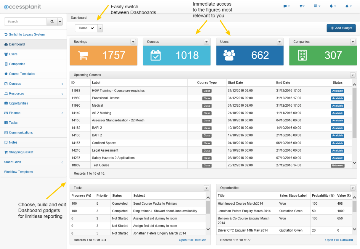
Dashboard highlights:
- Offer ‘at-a-glance’ headline information
- Can be customised to suit your role
- Looks great (I’m not kidding)
But let’s dig a little deeper.
What’s so great about dashboards anyway?
Imagine you had all the data you needed to deliver the best possible service, or efficiently and effectively manage training events and courses, or make or sound business decisions – and it was all right in front of you. Dashboards, essentially, offers an overview of the data you need, so you can see at a glance, for example, how many people are booked onto a course, or what your profits margins are. Then you can drill down further as and when you need to.
Dashboards for the training success platform have been designed to be simple, flexible and powerful. You choose the information you need and what’s known as a ‘gadget’ displays that information on screen. We’ve put all the tools in your hands. Now you and your team can decide for yourselves which information you need, and how best to use it.

What can I customise?
In short: Almost everything.
In long: Right off the bat, you can decide which gadgets are displayed. And how they’re displayed. And where they’re displayed. It’s just a matter of choosing which gadget you want – and there are plenty to pick from – then dragging and dropping it into place, and resizing to suit your needs.
Although the personalisation certainly doesn’t stop there. Choose your gadget and you’ll be greeted with a blank canvas of sorts. Here you can configure the gadget’s header, icon and colour-coding. You can also select key filters and columns, so that only the data you need is featured. To ensure you remain fully updated, there’s a choice to tweak the refresh rate of the gadget.
Dashboards, then, are the flexible, personal way to manage training.
Can I have more than one dashboard?
We know how important multiple dashboards are for many of you, so we’ve made sure you’re absolutely able to create several dashboards. Each of these can be accessed from a handy drop-down menu.
If you are seeking to use multiple dashboards, then it’s well worth creating a ‘Home’ dashboard – one that features all key data – and then subsequent dashboards that are focused on particular objectives, departments or individuals.
Can everyone have my dashboard?
In the interests of corporate uniformity, some of you may want to create a single, over-arching dashboard that’s fit for your whole team.
At present, we’re focused on ensuring true and total personalisation. So while there’s nothing to stop you from customising your dashboard in the same manner as the rest of your colleagues, for now we’re keen to ensure customisation takes centre-stage. In this way, even more members of your team can make use of what the new dashboard offers, since the system’s customisations allow them to configure it in the way that makes them most effective. Essentially, then it works both for and with each user.
Why so visual?
Our previous UI, on the Legacy system, doesn’t have the most inspiring interface. Utilitarian would be a good way of describing it. Outmoded might be another – like Windows 98, great for its time but now we’ve moved on…
So we’ve brought some strong colours and visuals to the new dashboard. Not only does that make the overall feel that much more engaging, it also means that you can set key icons and colour-code your dashboard gadgets for that easy ‘at-a-glance’ overview, or paint them in your brand palette.
We’ve also given the system a highly familiar layout, too, aping the interfaces of popular websites and programs we all often use, such as Facebook, Excel and Gmail. Which makes sense, since this is an online platform that’ll work on any kind of device.
Think how intuitive it is to use these – whether you’re checking notifications or performing a search or saving files, you do it without even thinking. Muscle memory takes over. It’s done before you even know what’s happening.
And that’s exactly how it feels using the training success platform.
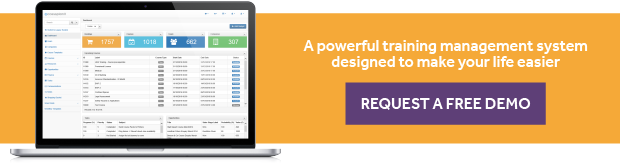
If you’d like to see the new system in action, including ways to use the dashboard’s overall flexibility for greater company effectiveness, then book yourself a free no-obligation demo today.
Other product updates you may be interested in:
New Feature: Multi-Dimensional Workflows Shape The Way You Manage Your Processes
New Feature: Restrive Reports Is A Thing Of The Past